JUNE 20TH, 2012 — JEREMY SHELLHORN
I was supposed to be fishing that was why I was here, but it was windy or slow or both…or maybe just maybe I had finally caught and released enough fish for the day. I had hiked and fished pretty hard like most who live in the flatlands and find themselves in the mountains for a few days and are trying to make up for lost time away from alpine streams and beautiful trout.
Anyway I wasn’t fishing for some reason and was wandering
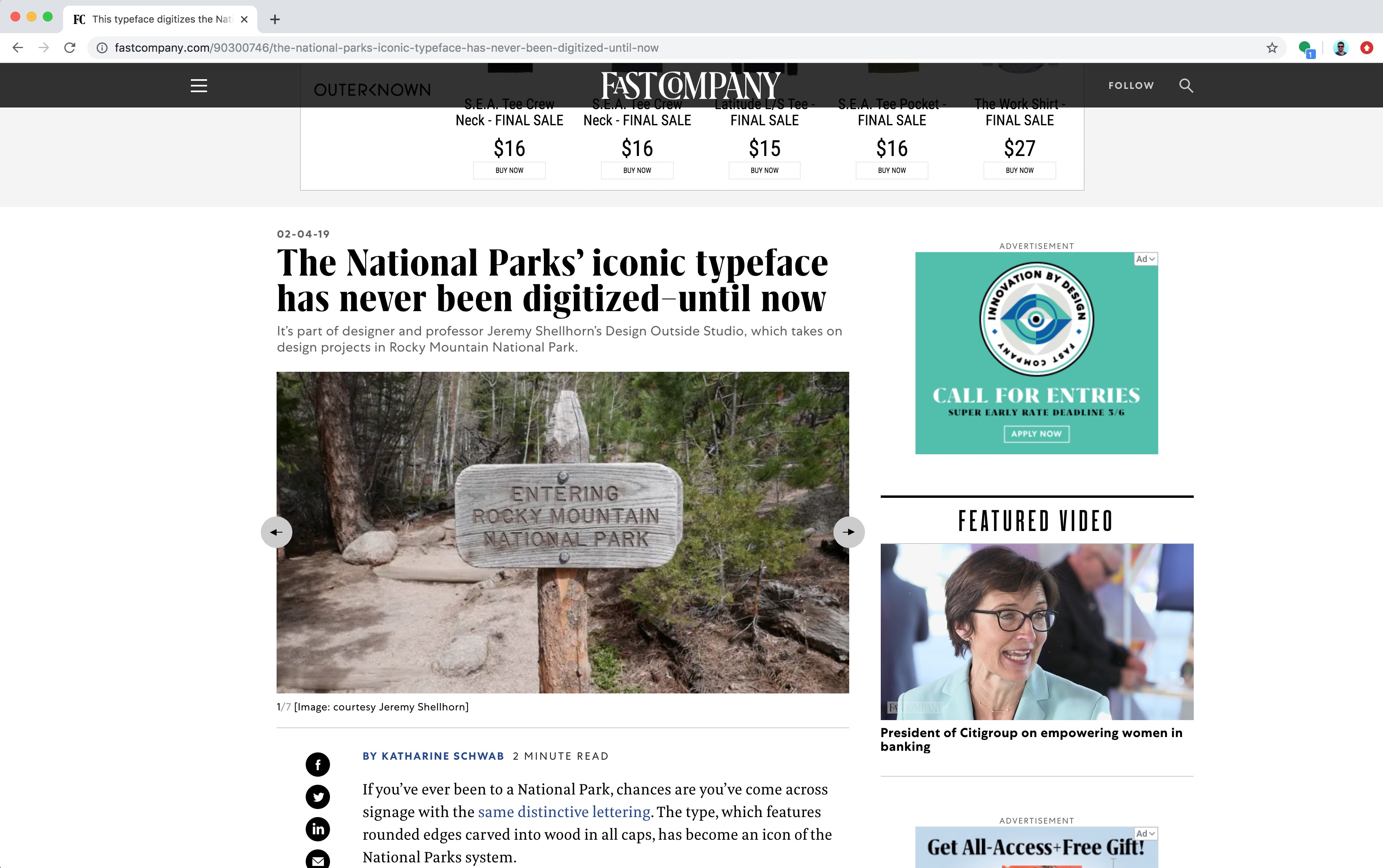
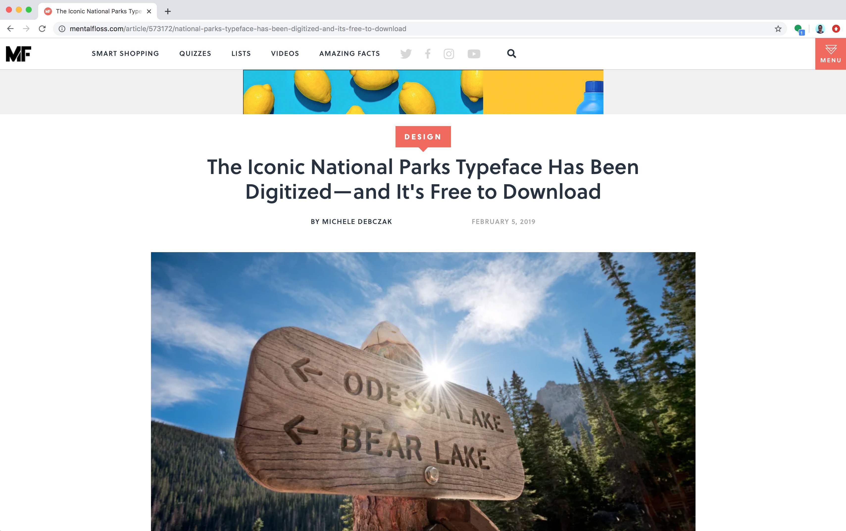
around following a deer trail turned into fisherman’s trail then back to another trail as sometime fisherman do. I had trekked pretty far that day and wasn’t exactly lost, but I needed a little reassurance that I was heading the right direction when I came across one of those ubiquitous signs you see in a national park. You know the ones that have the text carved or “routed” into it.
![]()
Entering Rocky Mountain National Park.
![]()
I saw those familiar words. Set “National Park Service, United States Department of the Interior” — style. I wondered if it actually was a typeface or “font” that anyone could download and use?
Do park rangers have this as a typeface on their computers to set in their word docs, pdfs and power point slides?
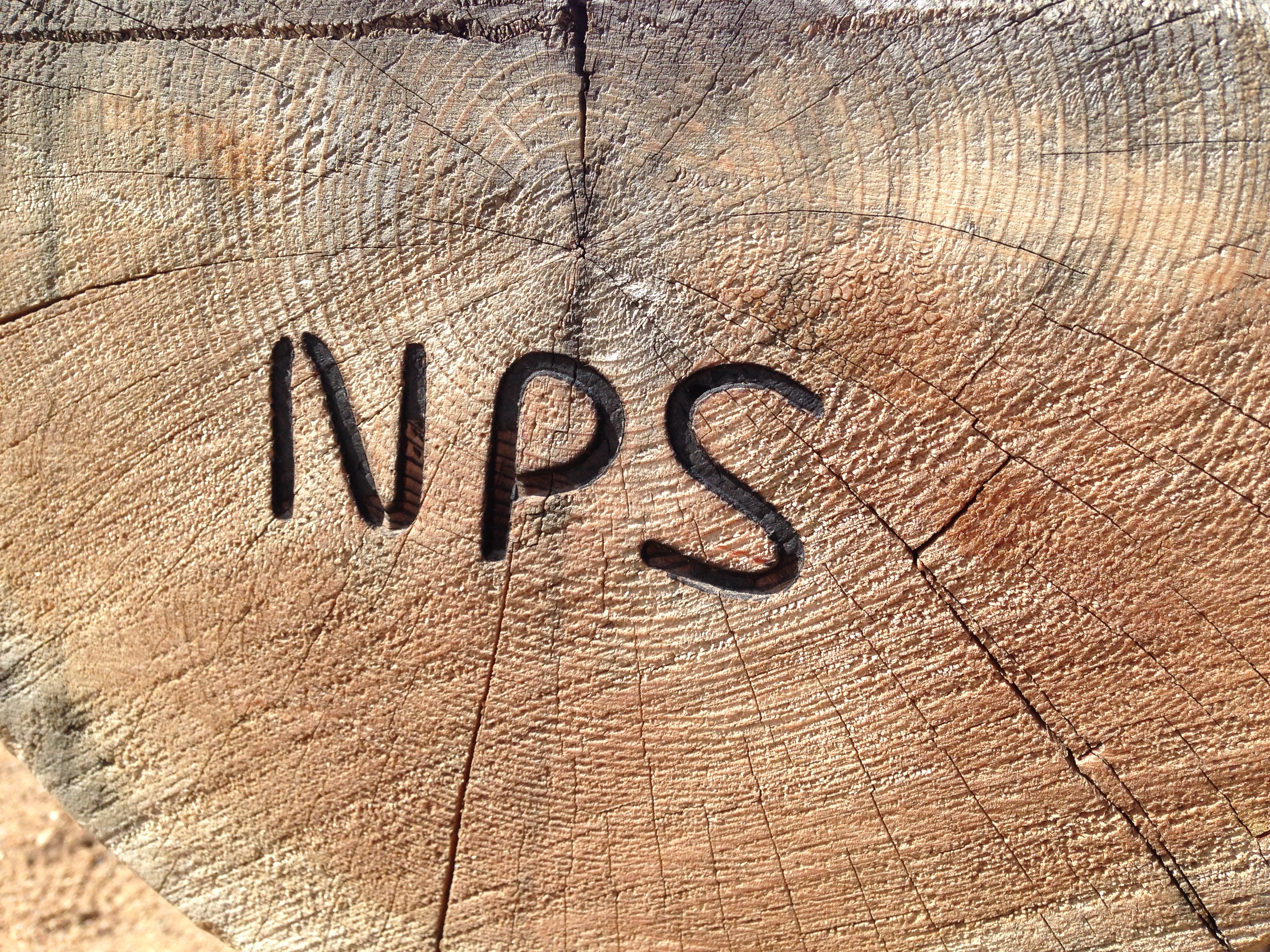
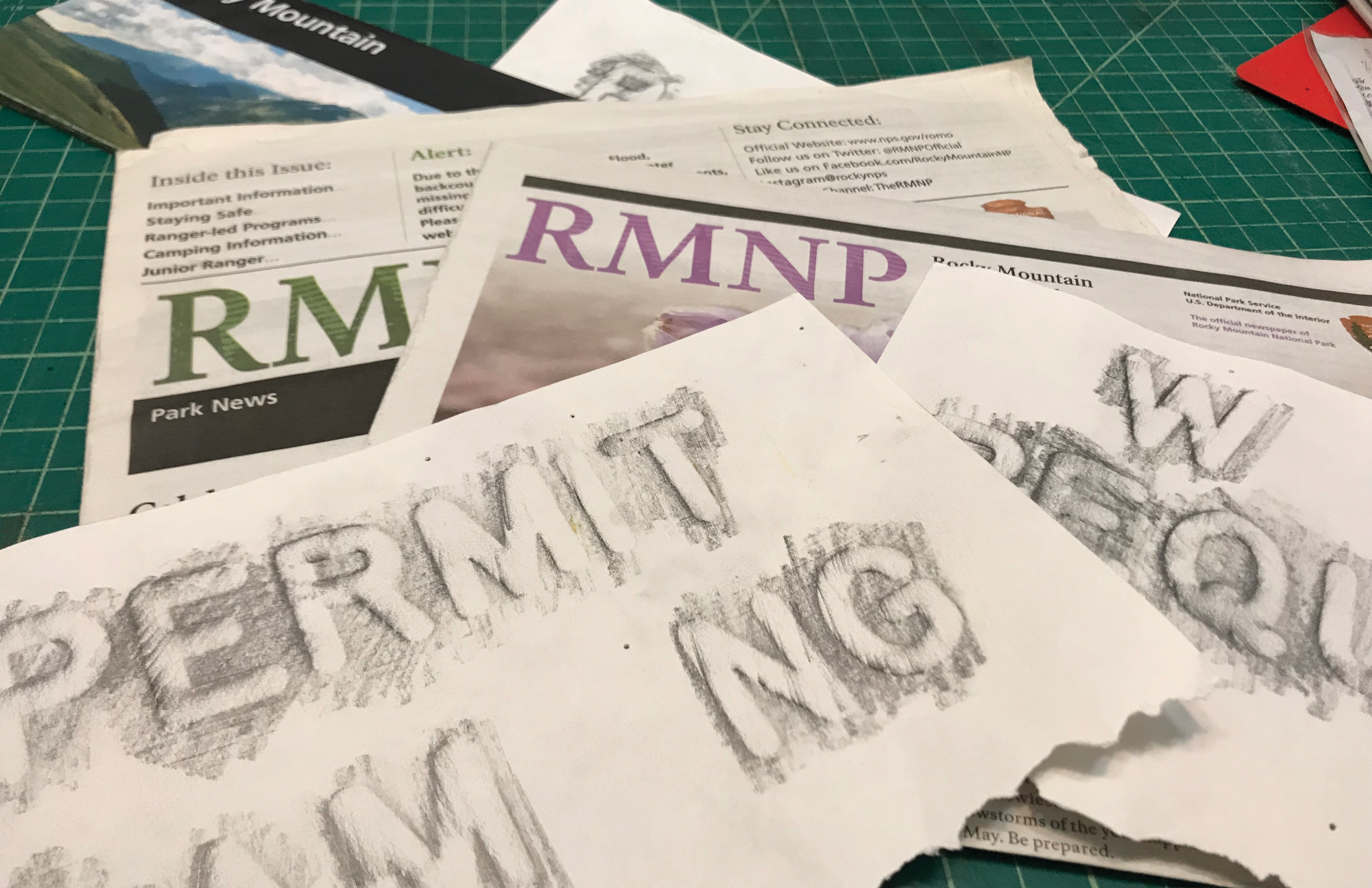
I had a sketchbook with me and took some rubbings of the letterforms and asked my friend Miles Barger, the Visual Information Specialist for Rocky, if he had the typeface.
![]()
He asked the sign shop. No one has it?
Turns out it isn’t a typeface at all but a system of paths, points and curves that a router follows. The router’s "bit" follows the path and gives the letters its stroke weight or thickness only when engraving a sign. It doesn't really exist as a typeface unless a sign is made.
![]()
![]()
So my design colleague, Andrea Herstowski, students Chloe Hubler and Jenny O'Grady, NPS Ranger Miles Barger and myself decided to make this router typeface a thing.
Our National Parks belong to the people, so this typeface should too.
I was supposed to be fishing that was why I was here, but it was windy or slow or both…or maybe just maybe I had finally caught and released enough fish for the day. I had hiked and fished pretty hard like most who live in the flatlands and find themselves in the mountains for a few days and are trying to make up for lost time away from alpine streams and beautiful trout.
Anyway I wasn’t fishing for some reason and was wandering
around following a deer trail turned into fisherman’s trail then back to another trail as sometime fisherman do. I had trekked pretty far that day and wasn’t exactly lost, but I needed a little reassurance that I was heading the right direction when I came across one of those ubiquitous signs you see in a national park. You know the ones that have the text carved or “routed” into it.
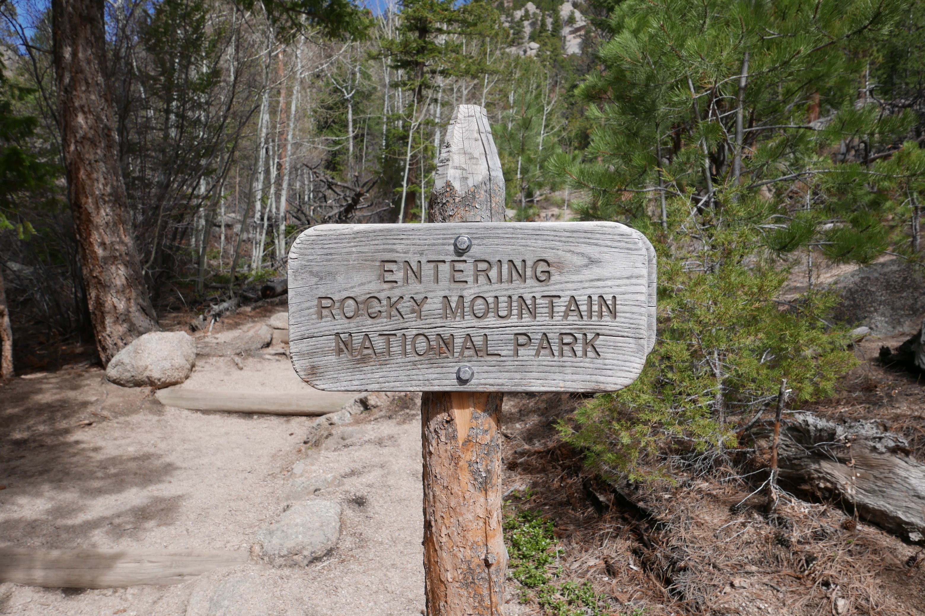
Entering Rocky Mountain National Park.
I saw those familiar words. Set “National Park Service, United States Department of the Interior” — style. I wondered if it actually was a typeface or “font” that anyone could download and use?
Do park rangers have this as a typeface on their computers to set in their word docs, pdfs and power point slides?
I had a sketchbook with me and took some rubbings of the letterforms and asked my friend Miles Barger, the Visual Information Specialist for Rocky, if he had the typeface.
He asked the sign shop. No one has it?
Turns out it isn’t a typeface at all but a system of paths, points and curves that a router follows. The router’s "bit" follows the path and gives the letters its stroke weight or thickness only when engraving a sign. It doesn't really exist as a typeface unless a sign is made.
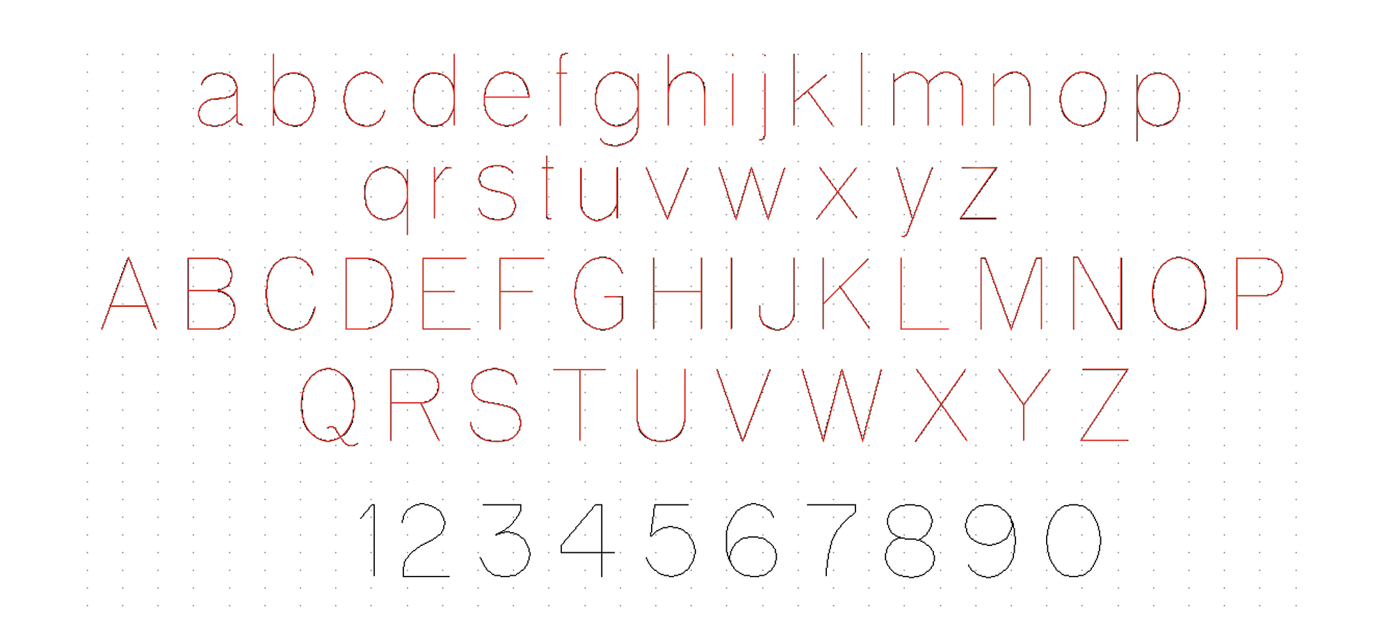

So my design colleague, Andrea Herstowski, students Chloe Hubler and Jenny O'Grady, NPS Ranger Miles Barger and myself decided to make this router typeface a thing.
Our National Parks belong to the people, so this typeface should too.