
Capturing the charm of the router-carved type ubiquitous in America’s national parks, without sacrificing legibility or versatility.
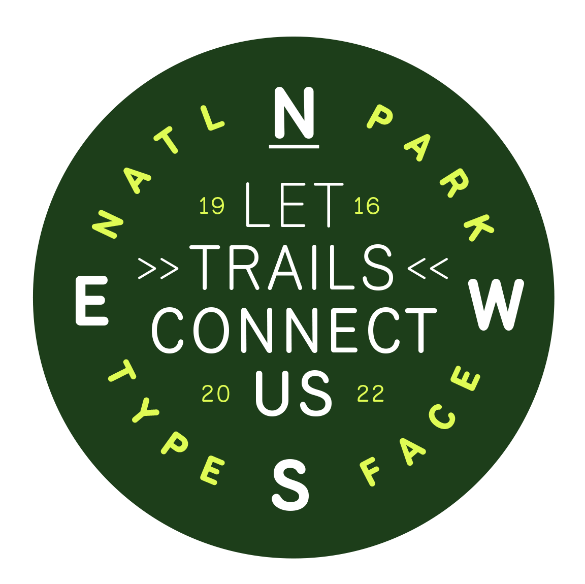
Each character’s design begins with a vector skeleton, (or series of coordinates) that a router would typically interpret and then carve into a wooden sign.
From there, we adjust each skeleton to be comfortably legible at each weight, and finally apply optical adjustments where an analog router can’t.
The result is a typeface that suits
a variety of uses at different sizes,
while staying true to much of the unique character and warmth of
its inspiration.